
PHE Insurance
Elevating a local insurance agency that has served Puget Sound Region for over 120 years with a modern website that tells a better brand story.
Project Details
Agency: Rusty George Creative
Role: Lead Designer & Researcher
Timeline: 3 months
Tools: Adobe XD, InVision, Adobe Creative Suite
Disciplines: UX Design, User Research, Site Architecture, UX Writing, Visual Design
The Challenge
PHE Insurance is a family owned insurance brokerage with a rich history that offers a complete line of Personal, Commercial and Employee Benefits products. In 2017 they invested in a new brand identity, but had a dated website that didn’t reflect the updated PHE branding and didn’t represent the values and culture of the company. Their site wasn’t responsive, had poor content quality and organization, and a confusing user interface and site structure.
Project Goals
Create a more compelling look that reflects PHE’s updated branding as well as values of the company
Design a more intuitive user experience
Showcase the company’s hardworking team of advisors and quality product offerings
Position as credible and relevant in the industry
Encourage site users to contact PHE directly
Research and Competitor Analysis
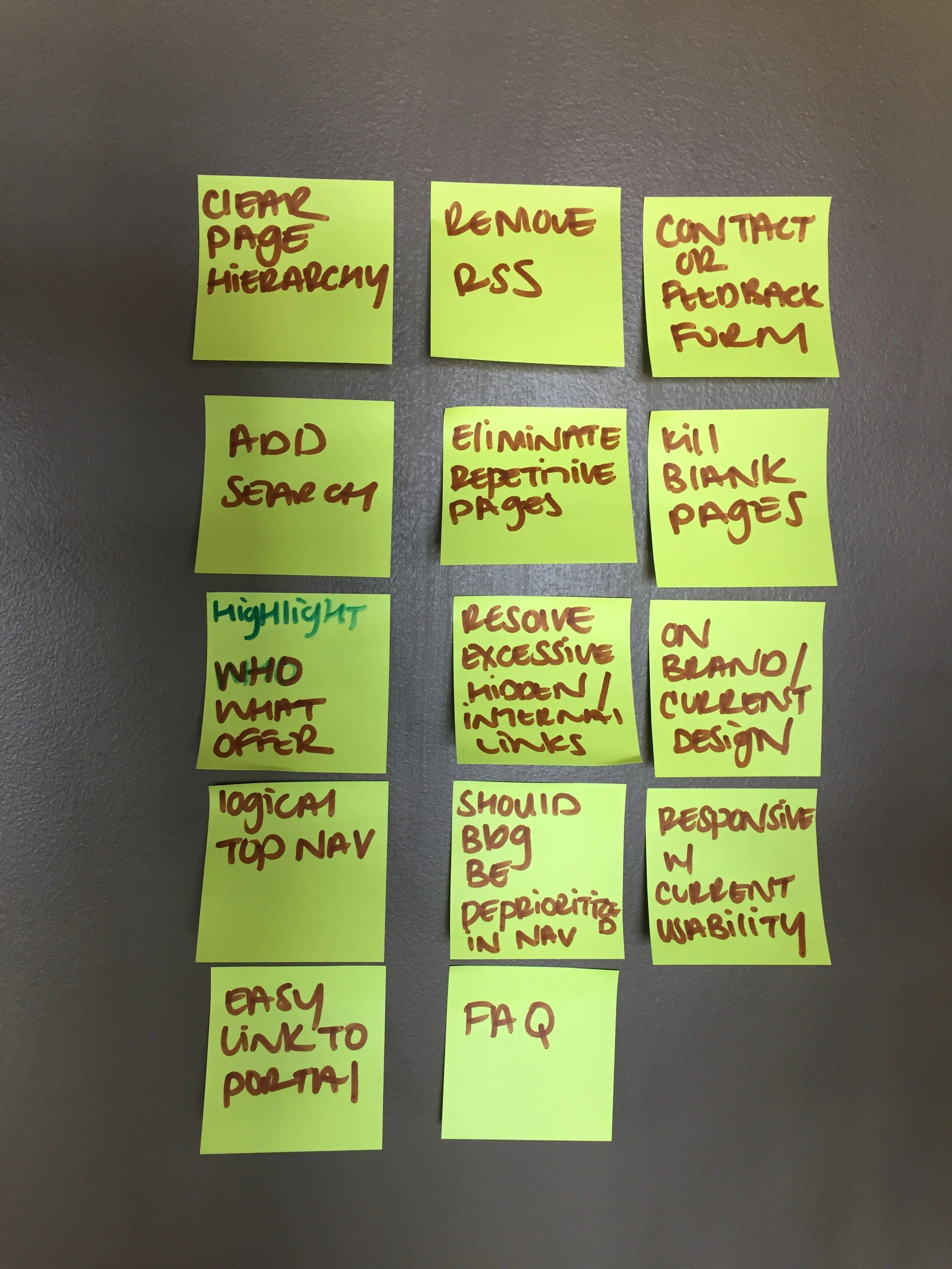
PHE offers high-quality and high-touch services, but that wasn’t coming through on their site. I did some heavy-lifting research and compiled a report that outlined current issues with the site in the areas of branding, content, and usability. After researching trends in other insurance websites, I created a competitive analysis chart and ranked how each site compared to the current PHE Insurance site. Check out the full Research Report.
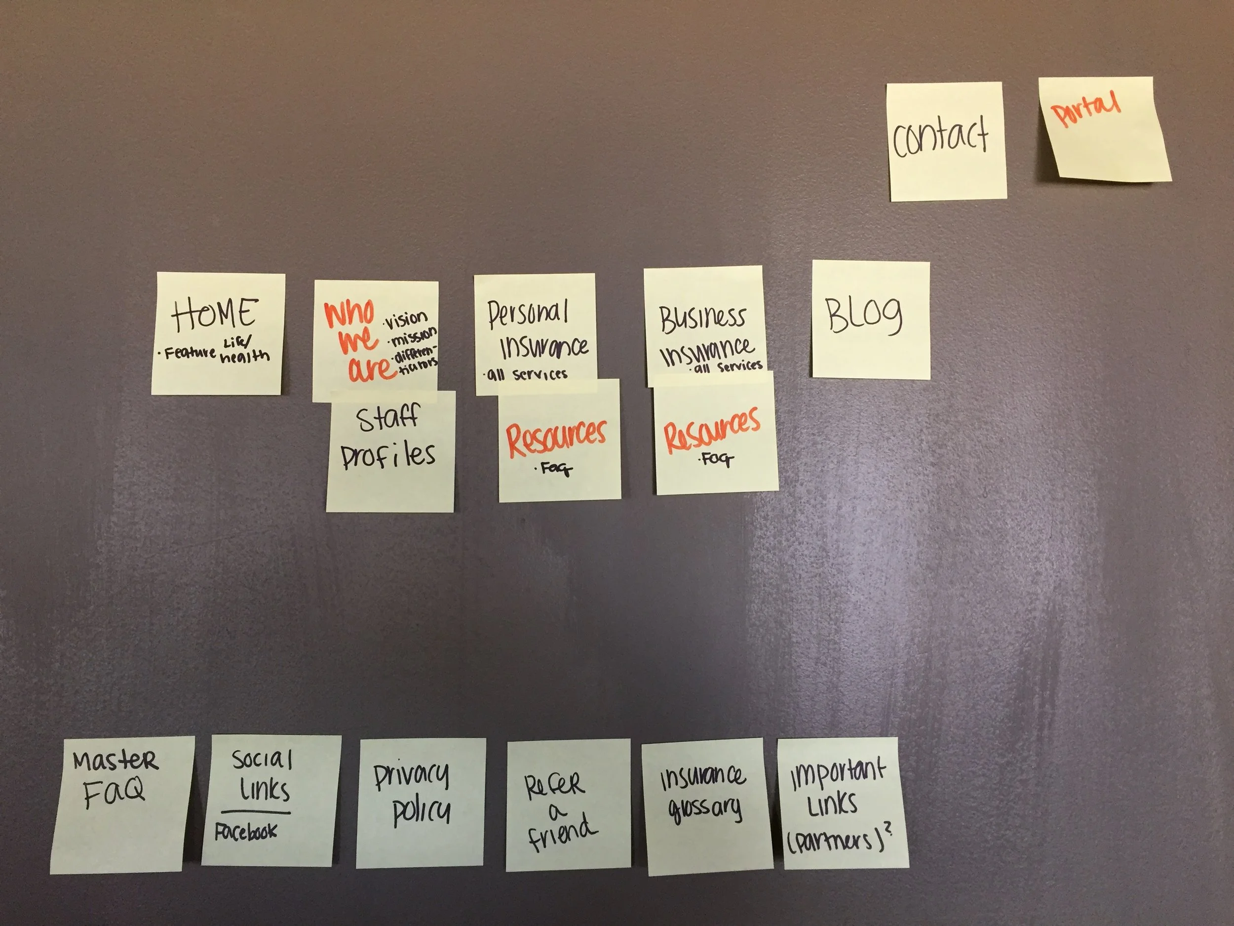
I facilitated a session with the clients and key stakeholders where we did a deep dive into the existing site content. Through a series of exercises, we identified the most important information from the website that needed to be included and cut unnecessary content that overloaded the experience. With that information, we then did a card sort with the client group and from there were able to utilize our personas below to build the site architecture.
Personas
I developed three personas based on the three main audiences for PHE Insurance’s new website that represent the varying potential clients seeking insurance services—Jeff, Keith, and Michelle—and built out user journeys based on their needs and goals to nail down the site architecture.
Site Architecture and Wireframing
After determining how the personas and users will flow through the site, we setup the sitemap to have a clear hierarchy and picture of the site and then moved into wireframes.
Sitemap
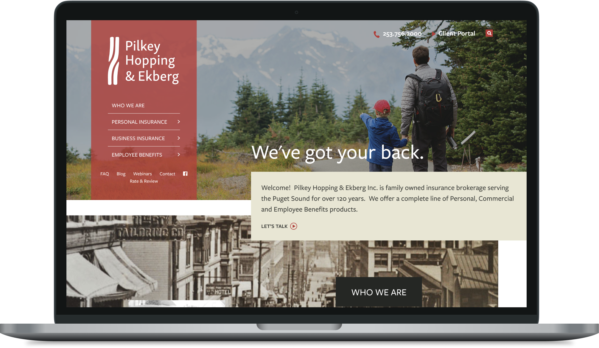
Homepage Wireframe
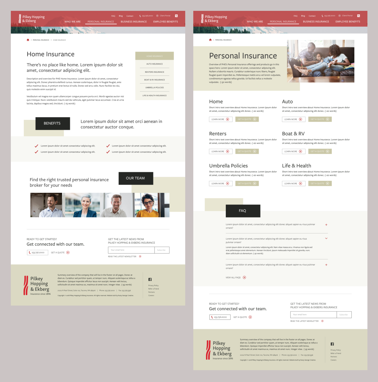
Insurance Landing Page Wireframe
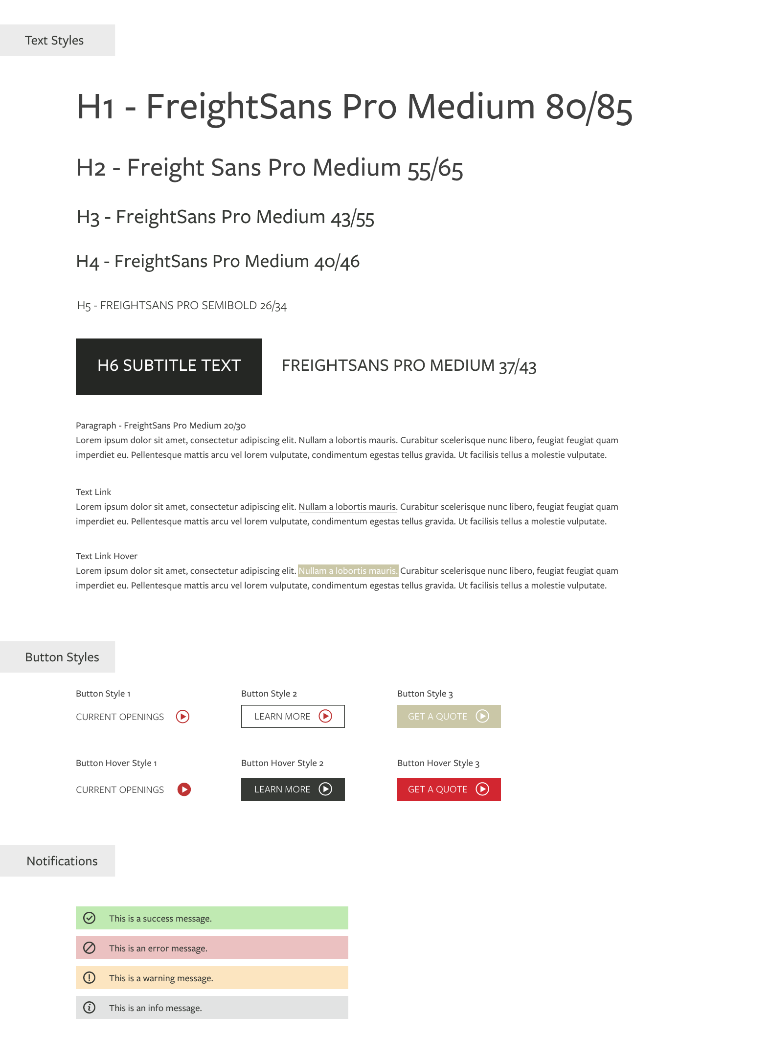
The Solution
Building off of the brand color palette and visual identity, we created a design that showcases PHE Insurance as the leader in the insurance industry in the area. Just in the few months that the site has been launched, we’ve heard from PHE that they have gotten 9 new clients that chose them over competitors based off of their new website design.